Learn how to build and utilize a multiple linear regression model using Python and real data.
Can Python Accurately Predict Your Next Medical Bill?
Using Real Data to Make Predictions
Have you ever wondered about how data science can be used to tackle real-world problems? In this hands-on tutorial, we’ll take a look into the world of predictive modeling by building a multiple linear regression model to estimate healthcare costs. Using Python and real data from This Insurance Dataset, we’ll explore how various factors might influence insurance premiums. This guide aims to bridge the gap between statistics and practical machine learning applications.
Prerequisites: Basic knowledge of Python (pandas, numpy, basic data visualization) and linear regression is recommended.
Use this google colab notebook to follow along: Linear Regression Tutorial
What you’ll learn:
- How to prepare data for regression analysis
- How to visualize relationships between variables
- How to build and interpret a predictive model
- How to evaluate model performance
1. Setting Up Your Python Environment 🐍
We’ll use these key libraries:
import pandas as pd
import numpy as np
import seaborn as sns
import matplotlib.pyplot as plt
from sklearn.linear_model import LinearRegression
from sklearn.model_selection import train_test_split
2. Preparing the Insurance Data 📊
First, load and preprocess the data. Here, we’re assuming you’ve downloaded the dataset as insurance.csv, adjust the path as needed. Or, if you’re using Google Colab, the dataset will be uploaded directly. If you’re using a different dataset, this tutorial will still be applicable with minor adjustments.
insurance_df = pd.read_csv('C:/Users/your_username/wherever_you_put/the_dataset/insurance.csv')
Simplify by removing region:
insurance_df = insurance_df.drop(columns = 'region')
Convert categorical variables to numerical:
insurance_df['sex'] = insurance_df['sex'].astype('category').cat.codes
insurance_df['smoker'] = insurance_df['smoker'].astype('category').cat.codes
Key Transformations:
regionwas removed for the simplicity of this tutorialsex(0 = female, 1 = male) andsmoker(0 = no, 1 = yes) were encoded to be quantitative
Note: If you attempt to recreate this code on a different dataset, ensure that you adjust the encoding for categorical variables accordingly (or skip this step if your data is already numerical).
3. Exploratory Data Analysis (EDA) 🔍
Let’s explore the data to understand the relationships between variables. This will help us identify which features are most influential in predicting insurance charges.
Age vs. Charges Relationship
Here, let’s visualize the relationship between policyholder age and insurance charges using a scatter plot.
sns.lmplot(x = 'age', y = 'charges', data = insurance_df,
line_kws = {'color': 'red'}, height = 6, aspect = 1.5)
plt.title('Age vs Insurance Charges')
plt.xlabel('Age (years)')
plt.ylabel('Charges ($)')
plt.tight_layout()
plt.show()
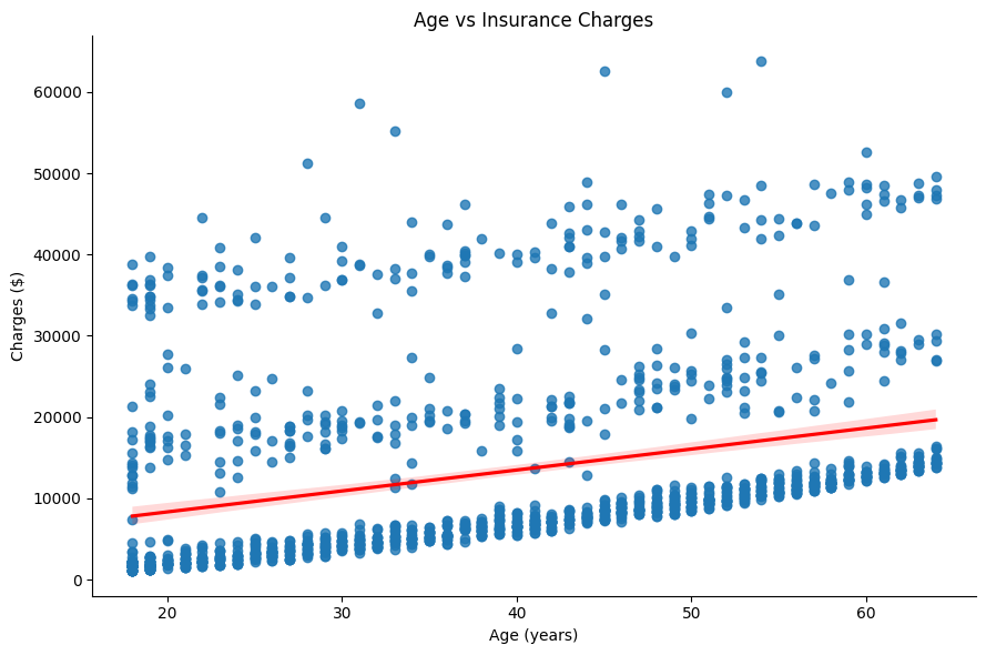
There is a clear linear relationship between age and charges. Older policyholders tend to have higher insurance charges.
Note: We skip the data cleaning step since the dataset is clean. Always check for missing values and outliers in your data before proceeding. We also skip assumptions testing for brevity.
Correlation Heatmap
Let’s also check the heatmap to see the correlation between features. This will help us understand which variables are most influential.
Pro Tip: Mess around with these settings to customize your heatmap!
plt.figure(figsize = (10,6))
sns.heatmap(insurance_df.corr(), annot = True, cmap = 'coolwarm', fmt = '.2f')
plt.title('Feature Correlation Matrix')
plt.show()
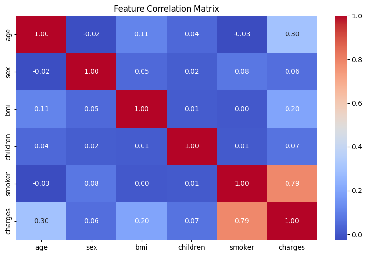
A positive correlation is seen between age and charges is visible, which confirms our earlier observation. We see that smoker has the greatest correlation with charges. The features with lower correlation values are less influential.
4. Building the Regression Model ⚙️
Now, let’s build a linear regression model to predict insurance charges based on the available features.
Train-Test Split
Here, using the train_test_split function from sklearn.model_selection, we can specify how much data we use to train the model and how much of the data we use to test the model using the test_size parameter. To explain this simply, when we “train the model” we show it lots of examples (training set) to learn patterns, then check its understanding with new data it’s never seen before (test set) to see if it really does a good job at predicting. It’s like teaching a student with practice problems, then giving them a final exam to see how well they learned!
Note: random_state is set to 42 to ensure reproducibility for those following along (like using the same practice problems and final exam for everyone).
X = insurance_df.drop(columns = 'charges')
y = insurance_df['charges']
X_train, X_test, y_train, y_test = train_test_split(
X, y, test_size = 0.2, random_state = 42)
Model Training
Here’s how to train the model. Here the ‘fit’ method is used to train the model on the training data. It essentially estimates the coefficients of the linear regression model.
model = LinearRegression()
model.fit(X_train, y_train)
5. Evaluating Model Performance 📈
Prediction Visualization
Using a scatter plot, let’s compare actual charges to predicted charges. With a good model, we would expect the points to fall close to the red line.
predictions = model.predict(X_test)
plt.figure(figsize = (10,6))
plt.scatter(y_test, predictions, alpha = 0.5)
plt.plot([y_test.min(), y_test.max()],
[y_test.min(), y_test.max()], 'r--')
plt.xlabel('Actual Charges ($)')
plt.ylabel('Predicted Charges ($)')
plt.title('Actual vs Predicted Insurance Charges')
plt.show()
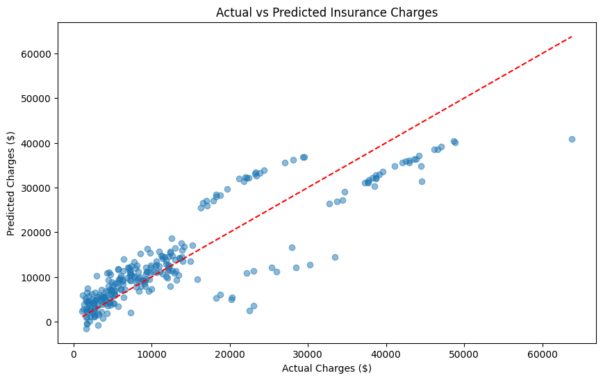
Not bad! The model seems to be doing a decent job of predicting insurance charges especially for lower charges. The points are close to the red line, indicating that the model is making reasonable predictions.
Residual Analysis
By plotting the residuals, we can check if our model is making systematic errors. Ideally, the residuals should be normally distributed around zero. Why is this important? If the residuals show a pattern, it means our model is consistently over or underestimating charges in which case we could use other techniques to improve our model (check ‘Next Steps & Challenges’).
Think of a bathroom scale that always shows your weight as 5 pounds less than it actually is. You would want to know that so you can adjust your weight accordingly!
residuals = y_test - predictions
plt.figure(figsize = (10,6))
sns.histplot(residuals, kde = True, bins = 25)
plt.axvline(0, color = 'red', linestyle = '--')
plt.xlabel('Prediction Error ($)')
plt.title('Residual Distribution')
plt.show()

It looks like the residuals are centered around zero, which is a good sign! We can see a little bit of right-skewness, but this is expected when working with any dataset dealing with money.
Model Score:
print(f'R² Score: {model.score(X_test, y_test):.3f}')
Output: R² Score: 0.781
This R² score indicates that our model explains 78.1% of the variance in the data.
6. Making Predictions 🚀
Let’s predict charges for:
- A 50-year-old male with a BMI of 30.970 who has 3 children and is a non-smoker
Here we can simply input the values into the model to get a prediction using model.predict. We created a list of lists data_predict to match the model’s input format.
u_age = 50
u_sex = 1 # 0 for female, 1 for male
u_bmi = 30.970
u_children = 3
u_smoker = 0 # 0 for non-smoker, 1 for smoker
data_predict = [[u_age, u_sex, u_bmi, u_children, u_smoker]]
predicted_charge = model.predict(data_predict)
print(f'Predicted charge: ${predicted_charge[0]:,.2f}')
Output: Predicted charge: $12,157.52
Looks like we are predicting a charge of about $12,000 for this individual which is fairly close to what was actually observed. You can now make predictions for any combination of features.
Try This: Modify the input values using This Colab Notebook if you haven’t been following along already!
Next Steps & Challenges 💪
Before we conclude with this tutorial, here are some additional features that could be of use to you in your linear regression journey!
Want to expirement with different techiques? Try:
- Adding polynomial features
- Testing regularization with Ridge/Lasso Regression
- Including interaction terms
Your Challenge: Can you beat an R² score of 0.783 using these or other techniques? Share your results in the comments and how you achieved them!
Conclusion & Resources
In this tutorial, we explored how to build a multiple linear regression model to predict insurance charges. We learned how to prepare data, visualize relationships, train a model, and evaluate its performance. Now you can apply these techniques to your own datasets and make predictions with confidence!
You’ve now built a complete regression model! For more advanced techniques and other useful tools, check out the resources below:
- Explore Scikit-learn’s Linear Models
- Learn advanced EDA with Seaborn Tutorials
- Practice with Kaggle Notebooks
Found this helpful? Share it with a friend or tweet about it!
Dataset Source: Kaggle Insurance Dataset